The Power of Typography
Enhance the design of your website, improve its overall usability, and boost the potential for increased conversions by thoroughly understanding typography. Discover how to effectively employ fonts, styles, and text arrangements to produce content that is both visually appealing and highly readable. Delve into essential principles, current trends, and practical steps that can substantially support your business's growth and success. With Keenfunnel, you gain access to expert insights and strategies designed to transform your website into a potent tool for engagement and customer conversion.
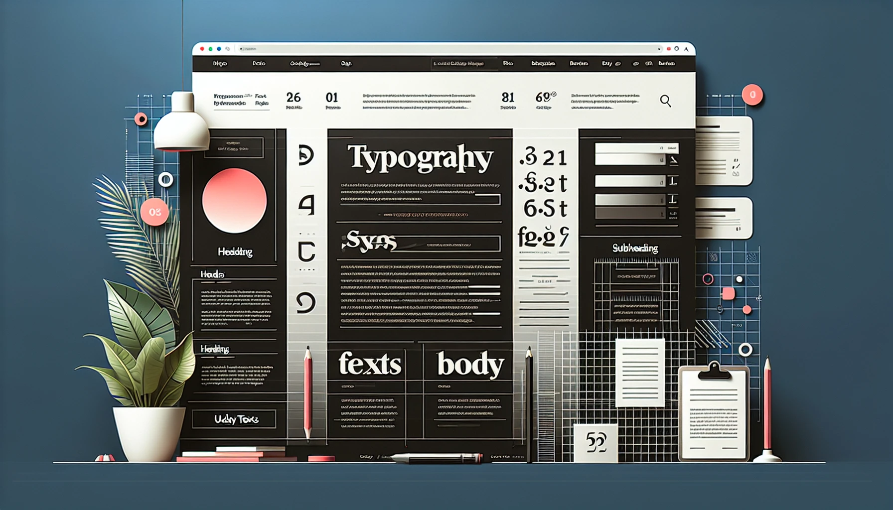
What is Website Typography?
Website typography is the art and science of arranging type on digital screens to maximize readability, brand expression, and user engagement. It’s not just about which fonts you pick—it’s how you combine, size, space, and color your text to create a seamless digital experience.
Typography is the outfit your website wears. Just as a tailored suit commands respect, strategic typography builds trust and drives action.
Why Typography Matters in Web Design
- First Impressions: 94% of first impressions relate to your site’s design, and typography is front and center.
- Brand Personality: Typefaces evoke emotion and set the tone (serif for tradition, sans-serif for modernity, script for elegance).
- Readability & Skimmability: Good typography guides the reader, making content easy to scan and understand.
- Conversions: Clear, compelling text improves user journeys and boosts conversion rates.
- Accessibility: Inclusive typography ensures everyone, including people with disabilities, can engage with your brand.
Research shows that different fonts can even affect how we perceive the taste of food or trustworthiness of products!
Key Typography Terms Every Marketer Should Know
Term | Definition |
Typeface | The design style (e.g., Helvetica, Georgia) |
Font | A specific weight and size in a typeface (e.g., Helvetica Bold 16px) |
Serif | Small decorative lines (serif) at the ends of letters |
Sans-serif | Fonts without decorative lines (modern, clean) |
Script | Fonts resembling handwriting |
Kerning | Space between individual letters |
Tracking | Overall spacing across a word/line |
Leading | Vertical space between lines |
Hierarchy | Visual ordering (e.g., H1, H2, body) |
Contrast | Difference in color or weight to distinguish text |
Principles of Effective Website Typography
1. Limit Fonts
- Use 2-3 complementary fonts for clarity and consistency.
- Example: Serif for headlines, sans-serif for body, accent font for CTAs.
2. Prioritize Readability
- Body text: 16–20px on desktop, 12–16px on mobile.
- Line length: 50–75 characters.
- Line height: 120–145% of font size.
3. Establish Hierarchy
- Use font size, weight, and color to make headings, subheadings, and body distinct.
- H1 > H2 > H3 > Body > Captions
4. Optimize Contrast
- Ensure sufficient contrast (WCAG recommends at least 4.5:1).
- Avoid low-contrast combinations (e.g., yellow on white).
5. Responsive & Accessible
- Use relative units (em/rem) for scalability.
- Avoid all-caps for body text.
- Test with screen readers and contrast checkers.
6. Consistency Across Devices
- Use web-safe fonts and set fallbacks in CSS.
- Test spacing and sizes on desktop, tablet, and mobile.
Typography Trends and Inspiring Examples
1. Bold Hero Text
- Make a memorable first impression with oversized, high-contrast headlines.
- Placeholder Image: Bold, minimalist homepage hero with clear call-to-action.
2. Gradient & Image Fills
- Use modern techniques like gradient text or image-filled letters for visual interest.
- Placeholder Image: Colorful gradient headline over a dark background.
3. Font Pairing for Emphasis
- Combine serif & sans-serif fonts for dynamic headings and readable body copy.
- Table: Example font pairings and their use cases.
4. Monospaced Fonts for Tech Feels
- Use monospaced fonts for code snippets, fintech, or brutalist designs.
- Placeholder Image: Monospaced code block or dashboard.
5. Highlights, Underlines, and Motion
- Draw attention to keywords with colored highlights, animated underlines, or subtle text motion.
- Placeholder Video: Animated underline effect for CTA links.
6. Expressive Display Fonts
- Try unique, decorative fonts for headlines (but keep body text simple for readability).
Accessibility & Responsive Typography
- Contrast & Color: Use tools like WebAIM Contrast Checker.
- Font Size: Allow user resizing (avoid fixed px sizes).
- Avoid Color-Only Cues: Use bold/underline in addition to color.
- Screen Reader Compatibility: Label headings properly with semantic HTML.
Optimizing Typography for Conversions
- Clear CTAs: Use distinct fonts and weights for calls-to-action.
- Hierarchy: Direct the user journey with prominent headings.
- Whitespace: Give text room to breathe for easier reading and focus.
- Brand Consistency: Reinforce your brand’s personality with consistent fonts.
- Testing: A/B test font choices, sizes, and colors for optimal engagement.
Keenfunnel’s Approach: Data-Driven Design
At Keenfunnel, we blend creative typography with conversion science:
- Custom Typography Strategy: We analyze your brand, audience, and industry for the perfect font stack.
- Optimized for Speed: Web-safe, fast-loading fonts for better SEO and UX.
- Accessibility-First: We design for all users, ensuring compliance and inclusivity.
- Real-Time Testing: We use analytics to A/B test typography decisions, refining for best results.
- Seamless Integration: Our solutions work across your CRM, marketing automation, and website platforms—no matter your tech stack.
Typography Resources & Tools
Tool / Resource | Description |
Google Fonts | Free, web-safe font library |
Adobe Fonts | Premium, licensed font selection |
WebAIM Contrast Checker | Test color contrast for accessibility |
Font Pair | Suggests font pairings |
Type Scale | Generates harmonious font sizes |
Keenfunnel Blog | Latest on UX, design, and conversion optimization |
FAQ: Typography for Business Websites
Q1: How many fonts should I use on my website?
A: For clarity, use 2–3 fonts: one for headings, one for body, and optionally one accent font for CTAs.
Q2: Which fonts are best for web readability?
A: Sans-serif fonts (like Open Sans, Roboto, Arial) are most readable for body text. Use serif or decorative fonts for emphasis.
Q3: How does typography affect SEO?
A: Readable, well-structured text improves engagement, reduces bounce rates, and signals quality to search engines.
Q4: How do I ensure my typography is accessible?
A: Use sufficient contrast, scalable units (em/rem), avoid color-only emphasis, and test with screen readers.
Q5: Can typography impact conversions?
A: Absolutely! Clear, compelling typography guides users to action and builds trust.
Q6: Can Keenfunnel help me optimize my site’s typography?
A: Yes! We offer website performance optimization, accessibility compliance, and custom design strategies tailored to your business.
Let Your Typography Speak Volumes
A thoughtfully designed typographic system is a powerful growth lever. With Keenfunnel’s expertise, your website will not only look stunning but also drive measurable results.